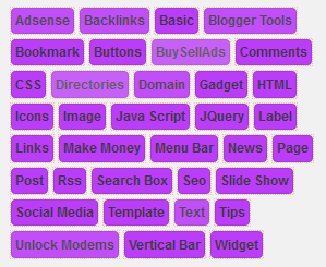
purple cloud label widget for blogger. So this labels
are neat and nice looking, peoples can find the any
categories easily. Few months ago i published few
post with different style cloud labels with various
colors. If this is not match for you. you can find
best one from below list. I cant provide demo for
this tutorial. If you have any problem with this
tutorial. Just leave a comment or contact me.

3. Now you can see Live on blog, Click EDIT HTML Button"
4. Now click Proceed button.
5. Find this tag by using Ctrl+F ]]></b:skin>
6. Paste below code Before ]]></b:skin> tag
/*-----Custom Labels widget by www.cool33bloggertrix.blogspot.com----*/
#Label1 a{
outline:1px dotted #FEB380;border: 1px rgba(0,0,0,0.2) solid;padding: 6px 8px 6px 14px;text-decoration:none;
color:black;white-space: nowrap;
font-family: arial,serif;text-transform:capitalize;
font-size: 12px;font-weight: bold;
position: relative !important;background: #aa00ff;
-moz-opacity:0.75;
-khtml-opacity:0.75;opacity:0.75;
filter:alpha(opacity:75%);
float:left;padding: 4px 3px;
margin: 0 5px 5px 0;
border-radius:4px 4px; -moz-border-radius:8px 4px 4px 4px; -khtml-border-radius:4px 4px 4px 4px; -webkit-border-radius:4px 4px 4px 4px; border-radius:4px 4px 4px 4px;
}
#Label1 a:hover {
-moz-opacity:1;
-khtml-opacity:1;
opacity:1;
background:#A55A27;color:white;
-webkit-transition:all ease-in-out .5s;
-moz-transition:all ease-in-out .5s;
-o-transition:all ease-in-out .5s;
transition:all ease-in-out .5s;
}
#Label1 a:active {
background:#B24700;color:#80FFFE;
-webkit-transition:all linear .5s;
-moz-transition:all linear .5s;
-o-transition:all linear .5s;transition:all linear .5s;
}
7. Now Click Save Template.
You are done...


 My Name Is Uxair Ahmed I'm Studying In Class 9th & Bel0ng To Karachi , Pakistan. I'm 15 Years Old & My Aim Is To Facilitate People With Useful Data. I Will Keep working on it..!!!
No comments:
Post a Comment